Following research into traditional newspaper, i found that the majority of newspapers include a logo on their masthead which accompanies the nameplate. The logos vary from random shapes to specifically meaningful objects. As my newspaper is a local paper, i want to ensure that Bristols heritage is included within the paper. The font selected for my nameplate helps do so by reflecting a slightly nautical theme, as does the blue colour scheme. Therefore, i have chosen to include an anchor for my logo as it will help reflect Bristols nautical heritage which will help show that the paper is local and trigger the attention of local readers.
In order to gain some inspiration when designing my logo, i have chosen to include some inspirational images below.
I find this logo is very simple, which helps create connotations of simplicity which could look effective next to the nameplate of my newspaper as the font is very detailed. Therefore the simplicity of this logo would ensure that it wasn't too overpowering. However, the fact that the logo is very symmetrical and simple could create connotations of structure and organisation which would make the newspaper appear very structured and organised as opposed to relaxed and comfortable to read.
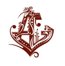
I find this logo very interesting as it combines the use of lettering to the logo which could help link the logo into the nameplate more effectively. I also find the use of swirls and flicks interesting as it help make the logo much more intriguing. However, the use of such swirl could make the logo appear much more feminine which could limit my audience as well. Also, the logo does appear very bold which, next to my nameplate font, could appear slightly overpowering, therefore its unlikely that i will include this technique in my final logo

This logo appears very interesting as it combines several nautical aspects such as a ship wheel and rope. This would help create stronger nautical connotations to strengthen the idea of reflecting Bristols heritage within the paper. I also really like the way the logo appear slightly cartoon like with the use of a distorted anchor and bold mixture of colour which helps the logo appear fun and interesting. However, the fact that the logo appears so animated could cause the paper to appear less mature and could limit the audience to a younger population. Therefore its unlikely that i will use such aspects in my logo.

This logo also uses the idea of combining several nautical aspects. This would also help create stronger nautical connotations which would help strengthen the idea of reflecting Bristols heritage. However, unlike the logo shown above, this logo appears much more structured and formal, similarly to the first logo mention. This would therefore ensure that my newspaper appear formal and informative which would follow the traditional conventions of a conventional newspaper.
Overall, from researching the logos shown above, i hope to include aspects from each of them. I want to ensure that my logo has very obvious nautical connotations to help reflect Bristols nautical heritage. I also want to ensure that my newspaper appears fun and exciting through the use of colour and pattern, however i still want to ensure that my newspaper appears formal and informative as so i must ensure that the logo doesn't appear too overpowering, especially when featured next to my nameplate font.

No comments:
Post a Comment